This protocol presents a reproducible workflow for analyzing spatial transcriptomics data, guiding users from public data acquisition and Seurat-based quality control through integration, spatial feature detection, cell-type deconvolution, region-of-interest annotation, and cell–cell communication analysis, with practical checkpoints that support transparent execution.
Method Article
A Practical Workflow for Spatial Transcriptomics Data Analysis: From Data Acquisition to Advanced Analyses
Opens in a new tab
In This Article
Summary
Loading...
$$\rightleftharpoonup{xx}$$
$$\longleftharp{xx}$$,
$$\longrightharp{xx}$$,
Abstract
Loading...
$$\rightleftharpoonup{xx}$$
$$\longleftharp{xx}$$,
$$\longrightharp{xx}$$,
Spatial transcriptomics (ST) profiles genome-wide gene expression while preserving the two-dimensional spatial context of mRNA molecules within tissue sections, enabling studies of tissue architecture and microenvironment-associated biology. However, ST analysis remains challenging because data import, quality control, integration, deconvolution, spatial statistics, and visualization often require multiple software environments and reproducible parameter choices. This protocol presents a practical computational workflow for public ST datasets in R, beginning with data acquisition and software setup and proceeding through Seurat-based data loading, quality control, normalization, multi-sample integration, clustering, and spatially variable gene analysis. The workflow then applies complementary deconvolution strategies, including reference-guided SPOTlight analysis and unsupervised STdeconvolve topic modeling, followed by Giotto-based spatial cell-cell communication analysis and interactive region-of-interest (ROI) selection using a custom Python Dash application. By emphasizing script-based execution, explicit parameter rationales, expected outputs, and troubleshooting checkpoints, the protocol provides an adaptable framework for standard array-based ST datasets and related platforms after dataset- and platform-specific parameter evaluation.
Introduction
Loading...
$$\rightleftharpoonup{xx}$$
$$\longleftharp{xx}$$,
$$\longrightharp{xx}$$,
Spatial transcriptomics (ST) is a transformative family of technologies that measures genome-wide gene expression while retaining the spatial coordinates of messenger RNA (mRNA) molecules within tissue sections. ST methods include sequencing-based approaches that use position-barcoded arrays and in situ imaging approaches that map transcriptional signals within intact tissue microenvironments1,2. By preserving spatial context, ST enables analysis of tissue architecture, cellular neighborhood organization, cell-cell communication, and microenvironment-associated biological processes that cannot be fully resolved after tissue dissociation3.
The rapid growth of public ST data repositories has created unprecedented opportunities for secondary analysis and method development3. Resources such as the CROST database curate hundreds of spatially resolved transcriptomic datasets across multiple species and technology platforms, while specialized collections like STOmicsDB focus on particular methodologies such as Stereo-seq4,5. Despite this data abundance, computational analysis remains challenging due to the complexity of spatial data structures, diversity of analytical tools, and technical hurdles in implementing reproducible workflows6,7,8,9,10,11.
To address the limitations of relying on a single software environment, an integrated computational workflow utilizing complementary analytical tools is presented herein. Existing comprehensive ST analysis ecosystems primarily include Seurat, Giotto, and Python-based frameworks such as Squidpy6,7,12. Although Python-based tools like Squidpy offer extensive functionalities for spatial graph analysis, consolidating the primary computational pipeline within a single programming language environment minimizes cross-language technical hurdles. Consequently, the core pipeline is implemented mainly in R to reduce cross-language technical hurdles. Within this R-based workflow, Seurat is used for data loading, quality control, normalization, dimensionality reduction, visualization, and multi-sample integration, reflecting its common use in single-cell and spatial transcriptomics workflows. Giotto is then used for spatial network construction and ligand-receptor-based cell-cell communication analysis. Therefore, this pipeline links Seurat-based pre-processing and integration with Giotto-based spatial analysis while keeping the data transfer between the two toolsets explicit and reproducible.
Within this framework, two complementary deconvolution strategies are implemented: SPOTlight, a reference-guided method that uses scRNA-seq data to estimate cell-type proportions, and STdeconvolve, an unsupervised topic-modeling method that identifies latent transcriptional patterns8,11. The outputs provide complementary views of spatial cellular heterogeneity but are not treated as a quantitative cross-validation unless users perform the optional concordance analysis described in the protocol. A custom Python Dash application, Select Spatial Spots, is integrated for interactive region-of-interest (ROI) annotation and exports standard coordinate-based annotation files that can be used in subsequent downstream analyses.
Regarding practical applicability, this workflow is intended primarily for standard array-based ST data (e.g., 55 µm resolution Visium) and may be adaptable to other tissue types after parameter evaluation. Key limitations should be considered before analysis. First, the reference-guided deconvolution module depends on a high-quality, tissue-matched scRNA-seq reference. Second, subcellular or near-single-cell platforms may require modified pre-processing, spatial bin aggregation, or image-based cell segmentation before integration2. The representative mouse colon dataset is used as a demonstration case to show how the workflow can evaluate spatial domains and marker-defined tissue organization rather than as evidence of universal platform compatibility.
Protocol
Loading...
$$\rightleftharpoonup{xx}$$
$$\longleftharp{xx}$$,
$$\longrightharp{xx}$$,
All biological datasets analyzed in this protocol are publicly available and used strictly for demonstration. Specific data accessions and source repositories are provided in the relevant steps. The original datasets were generated by the original investigators in compliance with institutional ethical guidelines applicable to each source study. See the Table of Materials to verify all required software and R-package versions.
Hardware requirements: The computational memory required for this workflow scales with the number of samples and spots analyzed. For a typical spatial transcriptomics dataset (e.g., approximately 3,000 spots per sample across up to three samples), a standard workstation with a minimum of 16 GB of RAM is sufficient to execute the pipeline. However, 32 GB of RAM or higher is highly recommended to ensure optimal performance and stability, particularly during memory-intensive computational steps such as SCTransform normalization and matrix factorization during deconvolution.
1. Data acquisition and directory structure preparation
- Obtain public spatial transcriptomics datasets (e.g., GEO accession GSE169749, with a submission date of March 26, 2021, and last update date of March 6, 2022) and single-cell RNA-seq reference data (e.g., GEO accession GSE264408, with a submission date of April 19, 2024, and last update date of December 10, 2024).
- Download the raw data archive (e.g., GSE169749_RAW.tar) from the repository and extract the archive.
NOTE: For the representative dataset used in this protocol, the extracted directory contains multiple files for each sample, with filenames typically incorporating the GEO sample accession (e.g., GSM5213483). - Organize the files into a standardized directory structure compatible with the Seurat Load10X_Spatial function.
- Create a main data directory (e.g., ./data/).
- Create a dedicated subdirectory for each sample (e.g., ./data/sample_A1/).
- Transfer (copy or move) the following essential files for each sample into the respective subdirectory.
- Place the filtered_feature_bc_matrix.h5 file into the main subdirectory of the sample.
- Create a spatial/ subfolder within each sample directory.
- Place the following files into the spatial/ subfolder: tissue_positions_list.csv.gz, scalefactors_json.json.gz, and tissue_hires_image.png.gz.
- Decompress the .gz files in the spatial/ folder. Ensure the original filenames remain exactly as required by the Load10X_Spatial function (e.g., tissue_positions_list.csv).
NOTE: The final, organized structure for seamless loading must follow this pattern, using sample A1 as an example:
./data/sample_A1/filtered_feature_bc_matrix.h5
./data/sample_A1/spatial/tissue_positions_list.csv
./data/sample_A1/spatial/scalefactors_json.json
./data/sample_A1/spatial/tissue_hires_image.png
2. Software environment setup
- Install R (version 4.4.3 or higher).
- Obtain the analysis scripts (1_ReadSpatialData.R through 8_Giotto_Communication.R) from the GitHub repository (https://github.com/LeafLight/SpatialTranscriptomicsWorkFlow, at commit hash 2d85e18 for reproducibility).
- Install the required R packages from CRAN and Bioconductor by executing the script setup.R.
NOTE: A comprehensive list of the specific package versions utilized in this workflow is provided in the Table of Materials and is also available in the session_info.txt file within the associated GitHub repository (https://github.com/LeafLight/SpatialTranscriptomicsWorkFlow). - Install Giotto Suite by executing the installation commands provided in the official documentation.
- Navigate to the official installation URL to retrieve setup scripts: https://giottosuite.com/articles/installation.html
- Initialize the required Python environment and system dependencies according to the step-by-step instructions.
- Install additional packages for enhanced visualization.
- Execute: install.packages(c("ggprism", "colorBlindness"))
- Install the custom Select Spatial Spots tool. Ensure the operating system is Windows, macOS, or Linux, and Python version 3.8 or higher is installed. This step is optional.
- Obtain the tool by navigating to the GitHub repository (https://github.com/LeafLight/SelectSpatialSpots, at commit hash d20946e for reproducibility) and downloading the source code.
- Navigate into the tool's directory and install the Python dependencies: pip install -r requirements.txt
- Install the glmGamPoi package by executing BiocManager::install("glmGamPoi") to accelerate the SCTransform normalization.
NOTE: The core workflow requires only the packages listed in steps 2.1–2.3 and 2.6. The package Rfast2 is used to speed up the computation of Moran's I statistic. The optional packages in step 2.5 are for generating publication-ready plots with a prism-style theme (ggprism) and for accessing a colorblind-friendly palette (colorBlindness). The tool in step 2.6 enables the interactive spot selection functionality. Execute the sessionInfo() command and save the complete console output to a text file. This documents the exact software versions and package dependencies, which are critical for ensuring long-term reproducibility.
3. Spatial data loading and quality control (1_ReadSpatialData.R, 2_SpatialDataQC.R)
- Read the spatial data into Seurat objects.
- Use Read10X_Image to manually load the high-resolution tissue image, specifying the image.dir and image.name.
- Use Load10X_Spatial with the image parameter set to the image object created in step 3.1.1 to create the Seurat object.
- Calculate quality control metrics.
- Compute the percentage of mitochondrial reads using PercentageFeatureSet with the pattern ^mt-.
- Visualize and interpret the data based on QC metrics.
- Generate violin plots of nCount_Spatial, nFeature_Spatial, and percent.mt using VlnPlot.
- Create spatial feature plots of these metrics using SpatialFeaturePlot to identify spots outside of the tissue area.
NOTE: Visual checkpoint: Spots outside the tissue area typically display low UMI counts (nCount_Spatial < 500) and low gene detection (nFeature_Spatial < 200) - For demonstration purposes, apply filters to remove low-quality spots (e.g., subset(seurat_obj, subset = nFeature_Spatial > 200 & nCount_Spatial > 500)). This is an optional step.
NOTE: The primary goal of QC in spatial transcriptomics is to identify and annotate technical artifacts, such as spots outside the tissue. For the demonstration Visium colon data, nFeature_Spatial > 200 and nCount_Spatial > 500 remove low-complexity/background spots. For tissues with low RNA content or degraded sections, inspect violin and spatial feature plots before raising thresholds; for dense or high-UMI tissues, stricter thresholds may be appropriate. Avoid filtering solely on high expression values unless doublets, tissue folds, or clear artifacts are visible. Filtering is often not recommended as it physically removes spatial locations, which may disrupt the continuity of the tissue structure for downstream spatial analysis.
4. Data pre-processing, integration, and clustering (3_IntegrationAndClustering.R)
- Normalize and pre-process individual samples.
- Apply the SCTransform normalization to each sample separately with assay = Spatial.
- Integrate multiple samples.
- Prepare the list of SCT-normalized objects for integration. Ensure each object has an "RNA" assay by copying the "Spatial" assay: spatial_list[[1]][["RNA"]] <- spatial_list[[1]][["Spatial"]]
NOTE: Copying the "Spatial" assay into a standard "RNA" assay slot serves as a necessary workaround to ensure compatibility with downstream integration functions originally designed for single-cell Seurat objects. - Use SelectIntegrationFeatures and PrepSCTIntegration to identify shared variable features.
- Find integration anchors using FindIntegrationAnchors with normalization.method = "SCT".
- Integrate the data using IntegrateData with normalization.method = "SCT".
- Prepare the list of SCT-normalized objects for integration. Ensure each object has an "RNA" assay by copying the "Spatial" assay: spatial_list[[1]][["RNA"]] <- spatial_list[[1]][["Spatial"]]
- Perform dimensionality reduction and clustering on the integrated assay.
- Run PCA on the integrated data using RunPCA.
- Determine the optimal number of principal components (PCs) for downstream analysis by calculating the cumulative variance explained. Identify the elbow point programmatically (e.g., the point where cumulative variance exceeds 90% and marginal gain drops below 0.1%), using the code in 3_IntegrationAndClustering.R, lines 36-38. The resulting number of PCs is hereafter referred to as pc.use.
- Run RunUMAP with dims = 1:pc.use.
- Cluster the cells using FindNeighbors with dims = 1:pc.use and FindClusters with resolution = 0.5. Adjust resolution only after inspecting cluster stability and marker gene coherence.
- Perform differential expression analysis between target groups (e.g., "B1_colon_d14" versus "A1_colon_d0") using the FindMarkers function.
NOTE: Visual checkpoint: A successful integration will display appropriate mixing of samples in the UMAP plot while maintaining biologically distinct clusters.
- Identify spatially variable genes.
- For each original sample, run FindSpatiallyVariableFeatures using the "moransi" method on the "SCT" assay to compute spatial autocorrelation.
5. Single-cell reference data pre-processing (4_scDataPreProcessing.R)
- Read the single-cell RNA-seq count matrix using Read10X and create a Seurat object.
- Perform standard QC, normalization, and clustering.
- Calculate the percentage of mitochondrial reads (percent.mt) and filter cells (e.g., nFeature_RNA > 200 & nFeature_RNA < 7500 & percent.mt < 25).
- Normalize data using SCTransform, setting vars.to.regress = "percent.mt".
- Run PCA, UMAP, and cluster the cells using the dynamic PC selection method described in step 4.3.2.
- Annotate cell types.
- Calculate module scores for canonical cell-type marker genes using AddModuleScore.
- Annotate clusters based on the module scores and known biology. Alternatively, import pre-computed annotations from metadata.
6. Reference-guided Deconvolution with SPOTlight (5_SPOTlight_Deconv.R)
- Prepare data for SPOTlight.
- Convert the annotated single-cell Seurat object and the spatial Seurat object to SingleCellExperiment objects.
- Log-normalize the single-cell data using logNormCounts.
- Run SPOTlight deconvolution.
- Identify hypervariable genes (HVGs) on the single-cell data using modelGeneVar and getTopHVGs.
- Compute cell-type marker genes using scoreMarkers and filter for high-quality markers (e.g., mean.AUC > 0.8).
- Downsample the single-cell reference for each cell type to a manageable number (e.g., 50 cells) to reduce computational time.
- Execute deconvolution using the SPOTlight function with weight_id = "mean.AUC", group_id = "cluster", and gene_id = "gene".
- Visualize and export the results.
- Extract the deconvolution result matrix (cell-type proportions per spot).
- Use plotSpatialScatterpie to visualize the cellular composition on the spatial coordinates.
- Add the deconvolution results to the spatial Seurat object's metadata using AddMetaData. Expected output: a deconvolution matrix with cell-type proportion columns for each spatial spot, spatial scatterpie plots showing local cellular composition, and a Seurat object containing the deconvolution proportions as metadata.
7. Reference-free Deconvolution with STdeconvolve (7_STdeconvolve.R)
- Prepare the spatial data.
- Extract the raw count matrix from the spatial Seurat object using GetAssayData with slot = "counts".
- Remove low-quality spots and genes using cleanCounts from STdeconvolve (e.g., min.lib.size = 100).
- Identify the latent cell types.
- Further filter the corpus for genes expressed in a minimum fraction of spots using restrictCorpus (e.g., removeAbove=1.0, removeBelow = 0.05).
- Fit a Latent Dirichlet Allocation (LDA) model across a range of potential topic numbers (K) (e.g., Ks = seq(2, 9, by = 1)) using fitLDA.
- Select the optimal model based on minimum perplexity using optimalModel with opt = "min".
- Analyze and visualize the results.
- Extract the cell-type (topic) proportions (theta) and gene profiles (beta) from the optimal model using getBetaTheta.
- To aid in the biological interpretation of the deconvoluted topics, import region-of-interest (ROI) annotations generated by the "Select Spatial Spots" tool (see step 9.3.3). Use these annotations as the groups parameter in the vizAllTopics function to project the deconvoluted cell-type proportions back onto the spatial coordinates and color-code the spots by their ROI. This is an optional step.
NOTE: Expected output: STdeconvolve should return theta values representing topic proportions per spot and beta values representing gene profiles for each topic. If users wish to quantitatively compare the unsupervised STdeconvolve results with the reference-guided SPOTlight outputs (from Step 6), they can export both proportion matrices (theta from STdeconvolve and the SPOTlight matrix) and compute per-spot correlation or concordance metrics (e.g., Pearson or Spearman correlation) using standard R functions. Quantitative comparison between SPOTlight and STdeconvolve is optional and is not required for executing the core workflow; however, the relevant output matrices are available from Steps 6.3.1 and 7.3.1 for users who wish to perform such an analysis.
8. Spatial cell-cell communication using Giotto(8_Giotto_Communication.R)
- Convert the Seurat object to a Giotto object.
- Use the createGiottoObject function, providing the raw count matrix and spatial coordinates.
- Pre-process the Giotto object and add deconvolution results.
- Normalize the data using normalizeGiotto.
- Add the cell-type annotations (e.g., the major cell type from SPOTlight deconvolution) to the cell metadata using addCellMetadata.
- Infer spatially-informed cell-cell communication.
- Create a spatial network using createSpatialNetwork with method = "Delaunay" and name = "Delaunay_network".
- Load a ligand-receptor database into the R environment. Ensure the loaded object is formatted as a data frame with two distinct columns representing the ligand and receptor gene symbols (e.g., a pre-compiled mouse network from Zenodo: https://zenodo.org/api/records/15168114/files/lr_network_mouse.csv/content, version v6, published on April 7, 2025).
- Run exprCellCellcom with cluster_column = "celltype_major" to identify significant ligand-receptor interactions between cell types that are in spatial proximity. Expected output: a result table containing ligand-receptor pairs, source and target cell-type combinations, log2 fold-change values, and adjusted P values; retain significant interactions (e.g., p.adj < 0.05) for visualization.
9. Interactive spot selection with select spatial spots (6_SelectSpatialSpots.R)
- Prepare data for the interactive tool.
- Extract the spatial coordinates from the Seurat object using GetTissueCoordinates.
- Format and export the data.
- Format the coordinate data frame to contain the exact column headers: CELL_ID, X, and Y.
- Export the formatted data frame to a CSV file.
- Perform region-of-interest (ROI) analysis.
- Launch the custom Select Spatial Spots Dash application and load the CSV file.
- Interactively select spots based on spatial location.
- Export the list of selected spots and their assigned group/ROI labels as a new CSV file. Expected output: a CSV file with spot identifiers, X/Y coordinates, and assigned group/ROI labels that can be matched back to the Seurat object by CELL_ID.
Results
Loading...
$$\rightleftharpoonup{xx}$$
$$\longleftharp{xx}$$,
$$\longrightharp{xx}$$,
Workflow implementation and data integration illustrate major tissue features
The computational workflow was applied to mouse colon spatial transcriptomics data to illustrate the expected outputs across the analytical stages. As depicted in the workflow schematic (Figure 1), the pipeline began with data acquisition and quality control, where spatial feature plots delineated tissue boundaries (Figure 2A,B). Seurat's anchor-based integration workflow was then used to reduce technical batch effects while preserving interpretable biological variation. UMAP visualizations showed sample alignment and spatial clustering patterns after integration (Figure 2C,D). The quantitative, dynamic selection of principal components (PCs) based on cumulative variance was implemented to guide dimensional reduction and downstream clustering (see Supplementary Figure 1). Marker gene heatmap analysis showed distinct transcriptional profiles underlying the spatial clusters (Figure 2E).
To assess whether the computational clusters were consistent with the known anatomical architecture of colon histology, the expression profiles of canonical layer-specific marker genes were evaluated. The mucosal epithelium layer showed expression of epithelial cell markers, including Epcam and Krt8, alongside the goblet cell marker Muc2. Mesenchymal and stromal markers such as Col1a1 and Vim marked lamina propria and submucosal regions, whereas the outer muscularis propria layer was indicated by smooth muscle structural genes such as Acta2 and Tagln. The spatial restriction of these lineage-associated markers supports the interpretation that the integration and clustering workflow preserved major histological laminations of the colonic tissue along the mucosal-to-muscularis axis (see Supplementary Figure 2).
Following cluster validation, downstream differential expression analysis was performed to identify differentially expressed genes (DEGs) between experimental conditions (Figure 2F,G). Furthermore, spatially variable genes were identified using Moran's I statistic, highlighting genes with significant non-random spatial distribution across the tissue (Figure 2H).
Cellular deconvolution and spatial interaction networks reveal tissue microorganization
Processing of the single-cell RNA-seq reference data yielded annotations supported by QC filtering (Figure 3A), unsupervised clustering (Figure 3B), marker gene validation (Figure 3C), and concordance with independent annotations (Figure 3D). The cellular composition (Figure 3E) informed the downsampling strategy for deconvolution. SPOTlight estimated reference-guided cell-type proportions across spatial spots (Figure 4A,B), whereas STdeconvolve provided an unsupervised topic-modeling view of spatial cellular patterns (Figure 5B). The custom Select Spatial Spots tool provided histological context for these patterns (Figure 5A). Finally, using deconvoluted cell-type assignments, spatial communication analysis identified ligand-receptor interactions between spatially proximal cell-type groups (Figure 6A,B).
Troubleshooting observations from protocol optimization
During protocol optimization, several issues were identified that informed practical checkpoints. Suboptimal deconvolution results occurred when single-cell references were poorly matched to the tissue context, indicating the need to use tissue- and species-matched scRNA-seq data when available. Initial clustering attempts with default parameters did not always resolve expected biological structures; inspecting the PC selection, clustering resolution, and marker gene coherence helped identify spatially interpretable domains aligned with tissue anatomy. These observations provide practical examples of how users can diagnose common analytical problems during execution of the workflow.
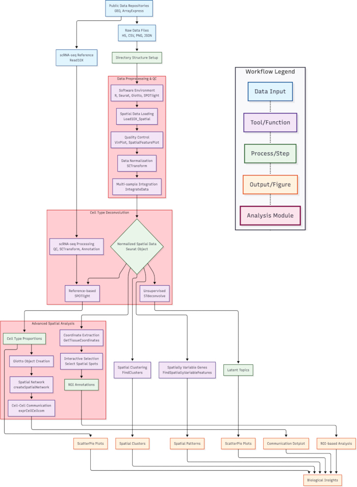
Figure 1: Workflow for integrated spatial transcriptomics analysis. Schematic representation of the analytical pipeline, from data acquisition and pre-processing to advanced spatial analyses. Key steps include: (1) Data loading, quality control, and multi-sample integration using Seurat; (2) Spatial clustering and detection of spatially variable genes; (3) Cell-type deconvolution via reference-based (SPOTlight) and unsupervised (STdeconvolve) methods; (4) Spatial cell-cell communication analysis with Giotto and interactive region-of-interest selection using a custom tool, Select Spatial Spots. Results from all modules are synthesized to derive biological insights into tissue architecture and cellular microenvironment. Please click here to view a larger version of this figure.
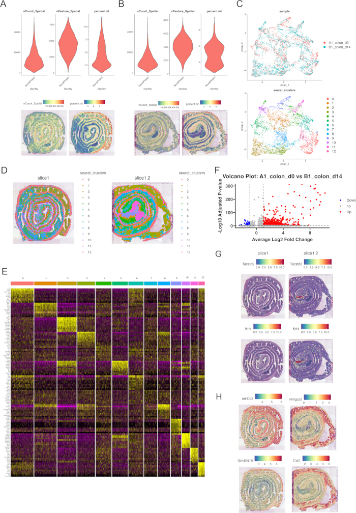
Figure 2: Data integration, clustering, and differential expression analysis. (A,B) Quality control metrics for spatial samples A1 and B1, showing distributions of gene counts, UMI counts, and mitochondrial gene percentages. (C) UMAP visualization of integrated spatial transcriptomics data colored by sample origin (left) and clustering identity (right). (D) Spatial projection of cluster identities onto tissue sections. (E) Heatmap of top marker genes for each spatial cluster. (F) Volcano plot displaying differentially expressed genes between conditions A1_colon_d0 and B1_colon_d14. (G) Spatial expression patterns of representative differentially expressed genes across tissue sections. (H) Spatial expression maps of top spatially variable genes identified via Moran's I statistic, with the left two panels displaying genes from sample A1_colon_d0 and the right two panels displaying genes from sample B1_colon_d14. Please click here to view a larger version of this figure.
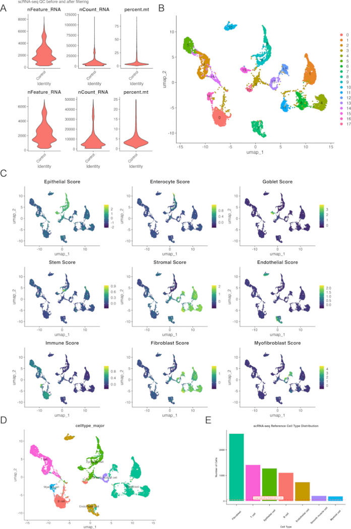
Figure 3: Single-cell reference data processing and annotation. (A) Quality control metrics for scRNA-seq reference data before and after filtering. (B) UMAP visualization of scRNA-seq data colored by unsupervised clusters. (C) Dot plot showing expression scores of canonical cell-type marker genes across clusters. (D) Annotated UMAP visualization of scRNA-seq data with major cell types labeled. (E) Cellular composition of the scRNA-seq reference dataset. The dashed red line indicates the downsampling threshold (n = 50 cells per type) applied during SPOTlight deconvolution to balance computational efficiency and cell-type representation. Please click here to view a larger version of this figure.
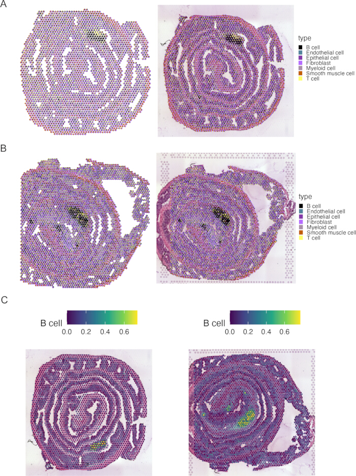
Figure 4: Spatial deconvolution of cellular heterogeneity. (A,B) Spatial scatterpie plots from SPOTlight deconvolution showing the proportional composition of major cell types at each spot for samples A1 (A) and B1 (B). (C) Representative spatial distribution of B cells in samples A1 (left) and B1 (right), demonstrating the spatially resolved localization patterns of a specific immune cell population identified through deconvolution. Please click here to view a larger version of this figure.
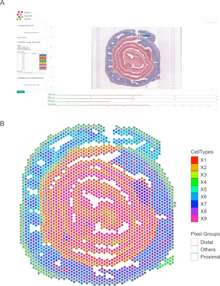
Figure 5: Interactive region-of-interest analysis and unsupervised deconvolution comparison. (A) Interface of the custom "Select Spatial Spots" tool showing interactive selection of regions corresponding to proximal colon, distal colon, and other tissue domains. (B) Spatial scatterpie visualization of unsupervised deconvolution results (STdeconvolve) for sample A1, with spots colored according to the manually annotated regions from (A), illustrating correspondence between histology-based annotation and computationally derived cell topic distributions. Please click here to view a larger version of this figure.
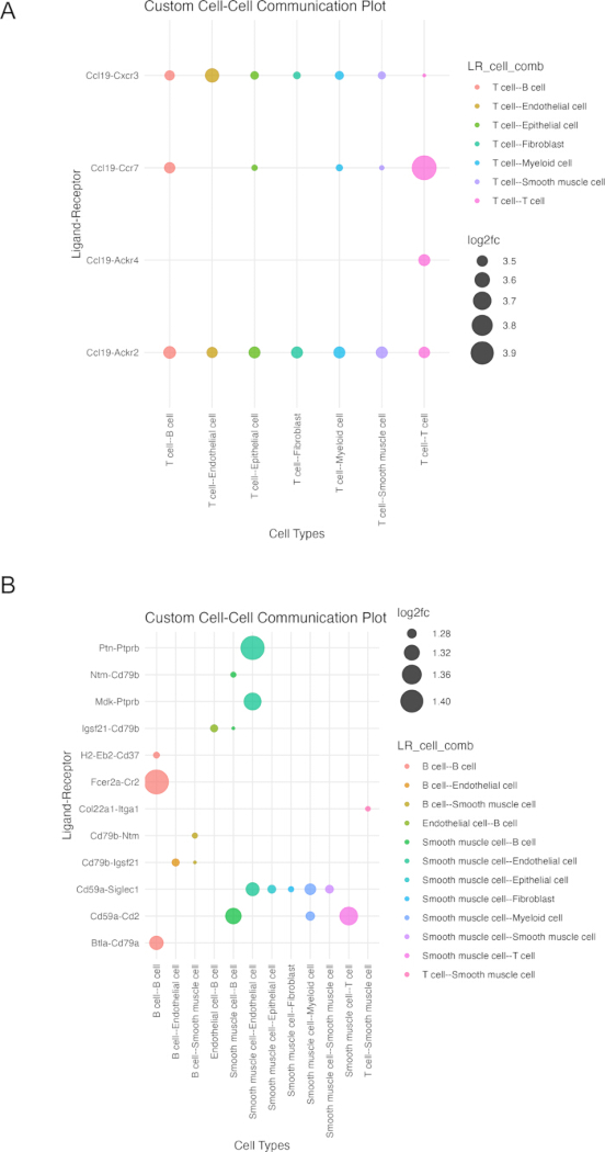
Figure 6: Spatially informed cell-cell communication networks. (A,B) Ligand-receptor interaction networks inferred by Giotto for samples A1 (A) and B1 (B). Nodes represent cell types, edges represent significant ligand-receptor pairs (FDR < 0.05), and edge thickness corresponds to interaction strength. To ensure comparability and visualization clarity, a uniform significance threshold (FDR < 0.05) was applied across all samples, and the top 20 interactions ranked by log2FC are displayed for each condition. Networks highlight cell-type-specific communication patterns within the spatial context of colon tissue. Please click here to view a larger version of this figure.
Supplementary Figure 1: Quantitative evaluation of parameter optimization for dimensionality reduction. The elbow plot demonstrates the workflow's programmatic approach to dynamically selecting the optimal number of principal components (PCs). The selection is calculated based on cumulative standard deviation and marginal variance thresholds, represented by the red vertical line, to capture biological variance while mitigating technical noise prior to downstream clustering.Please click here to download this file.
Supplementary Figure 2: Validation of spatial clustering using canonical colonic layer-specific markers. (A) Dot plot showing the enriched expression of epithelial, stromal, and smooth muscle markers across computational clusters. (B) Spatial feature plots mapping representative markers (Epcam, Col1a1, Acta2) back to the tissue coordinates.Please click here to download this file.
Discussion
Loading...
$$\rightleftharpoonup{xx}$$
$$\longleftharp{xx}$$,
$$\longrightharp{xx}$$,
This protocol provides a comprehensive computational workflow for spatial transcriptomics data analysis that balances analytical depth with practical accessibility. The step-by-step approach guides researchers through the complete analytical pipeline, from initial data acquisition to advanced spatial analyses, while emphasizing critical decision points and potential pitfalls.
Several steps in the protocol warrant particular attention due to their impact on downstream results. The quality control and filtering thresholds should be carefully tailored to specific tissue types and technology platforms, as overly stringent filtering may remove biologically relevant spots, while lenient thresholds can introduce technical noise. The choice of normalization method significantly influences downstream clustering and differential expression results. For instance, the pipeline uses SCTransform rather than standard log-normalization because SCTransform has been reported to model and reduce technical variation related to sequencing depth and other technical effects in single-cell and spatial workflows14,15. During integration, the selection of integration features and resolution parameters requires careful consideration to balance integration strength with preservation of the biological signal. For spatially variable gene calling, Moran's I was selected for computational scalability and suitability for spatial autocorrelation analysis in array-based data, although alternative callers such as SPARK may be considered depending on dataset size and study goals16.
The troubleshooting component of this workflow focuses on common interoperability problems that occur when passing outputs from one package to the next. Rather than relying on a single generic conversion step, the workflow uses customized format conversions at each software interface: spatial count data are copied into a standard RNA assay slot before Seurat integration; Seurat and single-cell reference objects are converted into SingleCellExperiment objects for SPOTlight; spatial count matrices are reformatted for STdeconvolve; Seurat-derived counts, coordinates, and cell-type metadata are converted into a Giotto object for cell-cell communication analysis; and ROI annotations from Select Spatial Spots are exported as CSV files with CELL_ID, X/Y coordinates, and group labels so they can be mapped back to the Seurat object. These steps help users identify and correct common problems such as incompatible assay slots, mismatched spot identifiers, missing metadata columns, incorrect coordinate formatting, and ligand-receptor gene-symbol mismatches.
An additional feature of this workflow is the use of two complementary deconvolution strategies rather than reliance on a single algorithm. SPOTlight uses prior scRNA-seq references for reference-guided estimation of cell-type proportions, whereas STdeconvolve enables reference-free discovery of latent transcriptional topics. In the demonstration dataset, STdeconvolve topics aligned with histologically defined regions (Figure 5B), supporting biological interpretability. A direct quantitative comparison between the two methods was not performed in this protocol; users who wish to benchmark them on their own data can follow the framework provided in protocol step 7.3.2. Furthermore, the protocol supports usability and traceability by using scripts for core functions while offering a graphical interface (Select Spatial Spots) for intuitive ROI isolation.
Linking Seurat and Giotto allows the workflow to combine Seurat-based pre-processing and integration with Giotto-based spatial statistics and network analysis. Seurat provides an established environment for researchers with scRNA-seq experience and supports multi-sample integration, whereas transferring the harmonized data into Giotto enables spatial network construction and ligand-receptor analysis. This design allows users to use the documented strengths of both platforms without implying that they have been benchmarked here against Squidpy or other frameworks. For cell-cell communication, Giotto's Delaunay network-based ligand-receptor inference was used because it incorporates spatial adjacency within the same analysis environment; frameworks such as CellChat provide extensive signaling databases but are not evaluated in this protocol17.
Several limitations must be considered. The reference-based deconvolution approach depends critically on the availability of high-quality, matched single-cell references. Furthermore, the fundamental assumptions behind cell-cell communication analysis rely on transcript co-expression as a proxy for physical protein interaction, requiring subsequent experimental validation. Finally, this workflow was primarily developed around standard Visium datasets. As the field advances toward near-single-cell resolution technologies such as Visium HD, analytical considerations will shift; higher resolution data may require different pre-processing parameters and reduce the absolute necessity for spot deconvolution. To adapt this workflow for Visium HD datasets, the high-resolution bins can be computationally aggregated into larger spatial bins, or spot-deconvolution modules can be bypassed in favor of image-based cell segmentation18.
These features suggest potential applicability across biological domains, including developmental biology, neuroscience, cancer research, and immunology19,20,21,22. The modular design allows researchers to adapt specific components to their needs, whether focusing on spatial domain identification, cellular communication, or regional specialization. As spatial technologies continue to evolve and datasets expand, this protocol provides a foundation that can be extended to incorporate new analytical methods and address emerging biological questions.
Disclosures
Loading...
$$\rightleftharpoonup{xx}$$
$$\longleftharp{xx}$$,
$$\longrightharp{xx}$$,
The authors declare no competing financial interests.
Acknowledgements
Loading...
$$\rightleftharpoonup{xx}$$
$$\longleftharp{xx}$$,
$$\longrightharp{xx}$$,
The authors thank the developers and maintainers of the Seurat, Giotto, and SPOTlight packages for their support and documentation. The contributions of public data repositories and the researchers who generously shared their datasets are also gratefully acknowledged.
Materials
| Name | Company | Catalog Number | Comments |
|---|---|---|---|
| ggplot2 | Posit Software, PBC | v4.0.0(CRAN) | Advanced data visualization |
| Giotto | Dries Lab | v4.2.2 (GitHub) | Spatial network and cell-cell communication analysis |
| patchwork | Thomas Lin Pedersen | v1.3.2 (CRAN) | Plot composition and arrangement |
| R software | R Foundation for Statistical Computing | v4.4.3 | Core execution environment (macOS aarch64) |
| scater | Davis McCarthy et al. | v1.34.1 (Bioconductor) | Single-cell quality control and visualization |
| scran | Aaron Lun et al. | v1.34.0 (Bioconductor) | Single-cell variance modeling and marker detection |
| Select Spatial Spots (Custom Python Tool) | LeafLight | v1.0.0 (GitHub) | Interactive spatial region-of-interest (ROI) selection (https://github.com/LeafLight/SelectSpatialSpots) |
| Seurat | Satija Lab | v5.3.0 (CRAN) | Spatial data preprocessing, integration, and clustering |
| SeuratObject | Satija Lab | v5.2.0 (CRAN) | Data structures for single-cell and spatial data |
| SingleCellExperiment | Bioconductor Core Team | v1.28.1 (Bioconductor) | Standardized data container for scRNA-seq |
| SPOTlight | Marc Elosua-Bayes et al. | v1.10.0 (Bioconductor) | Reference-guided spatial deconvolution |
| Stdeconvolve | Jean Fan Lab | v1.3.2 (Bioconductor) | Unsupervised latent topic modeling |
| tidyverse | Posit Software, PBC | v2.0.0 (CRAN) | Core data manipulation and formatting suite |
References
Loading...
$$\rightleftharpoonup{xx}$$
$$\longleftharp{xx}$$,
$$\longrightharp{xx}$$,
- Ozirmak Lermi N, Molina Ayala M, Hernandez S, et al. Comparison of imaging based single-cell resolution spatial transcriptomics profiling platforms using formalin-fixed paraffin-embedded tumor samples. Nat Commun. 2025;16(1):8499.
- Ren P, Zhang R, Wang Y, et al. Systematic benchmarking of high-throughput subcellular spatial transcriptomics platforms across human tumors. Nat Commun. 2025;16(1):9232.
- Danishuddin, Khan S, Kim JJ. Spatial transcriptomics data and analytical methods: An updated perspective. Drug Discovery Today. 2024;29(3):103889.
- Xu Z, Wang W, Yang T, et al. STOmicsDB: A comprehensive database for spatial transcriptomics data sharing, analysis and visualization. Accessed October 31, 2025. https://dx.doi.org/10.1093/nar/gkad933
- Wang G, Wu S, Xiong Z, Qu H, Fang X, Bao Y. CROST: A comprehensive repository of spatial transcriptomics. Nucleic Acids Res. 2024;52(D1):D882-D890.
- Chen JG, Chávez-Fuentes JC, O’Brien M, et al. Giotto Suite: a multiscale and technology-agnostic spatial multiomics analysis ecosystem. Nat Methods. 2025;22(10):2052-2064. doi:10.1038/s41592-025-02817-w
- Butler A, Hoffman P, Smibert P, Papalexi E, Satija R. Integrating single-cell transcriptomic data across different conditions, technologies, and species. Nat Biotechnol. 2018;36(5):411-420.
- Elosua-Bayes M, Nieto P, Mereu E, Gut I, Heyn H. SPOTlight: seeded NMF regression to deconvolute spatial transcriptomics spots with single-cell transcriptomes. Nucleic Acids Res. 2021;49(9):e50-e50.
- McCarthy DJ, Campbell KR, Lun ATL, Wills QF. Scater: pre-processing, quality control, normalization and visualization of single-cell RNA-seq data in R. Bioinformatics. 2017;33(8):1179-1186.
- Lun ATL, McCarthy DJ, Marioni JC. A step-by-step workflow for low-level analysis of single-cell RNA-seq data with bioconductor. F1000Research. Preprint posted online October 31, 2016. doi:10.12688/f1000research.9501.2
- Miller BF, Huang F, Atta L, Sahoo A, Fan J. Reference-free cell type deconvolution of multi-cellular pixel-resolution spatially resolved transcriptomics data. Nat Commun. 2022;13(1):2339.
- Palla G, Spitzer H, Klein M, et al. Squidpy: A scalable framework for spatial omics analysis. Nat Methods. 2022;19(2):171-178.
- Luecken MD, Büttner M, Chaichoompu K, et al. Benchmarking atlas-level data integration in single-cell genomics. Nat Methods. 2022;19(1):41-50.
- Hafemeister C, Satija R. Normalization and variance stabilization of single-cell RNA-seq data using regularized negative binomial regression. Genome Biol. 2019 Dec 23;20(1):296.
- Cuevas-Diaz Duran R, Wei H, Wu J. Data normalization for addressing the challenges in the analysis of single-cell transcriptomic datasets. BMC Genomics. 2024;25(1):444.
- Sun S, Zhu J, Zhou X. Statistical analysis of spatial expression patterns for spatially resolved transcriptomic studies. Nat Methods. 2020;17(2):193-200.
- Jin S, Plikus MV, Nie Q. CellChat for systematic analysis of cell–cell communication from single-cell transcriptomics. Nat Protoc. 2025;20(1):180-219.
- Zohora FT, Paliwal D, Flores-Figueroa E, et al. CellNEST reveals cell–cell relay networks using attention mechanisms on spatial transcriptomics. Nat Methods. 2025;22(7):1505-1519.
- Wang Q, Zhu H, Deng L, et al. Spatial transcriptomics: Biotechnologies, computational tools, and neuroscience applications. Small Methods. 2025;9(5):2401107.
- Chen MM, Gao Q, Ning H, et al. Integrated single-cell and spatial transcriptomics uncover distinct cellular subtypes involved in neural invasion in pancreatic cancer. Cancer Cell. 2025;43(9):1656-1676.e10.
- Li H, Guan W, Huang J, et al. A complete model of mouse embryogenesis through organogenesis enabled by chemically induced embryo founder cells. Cell. 2025;188(21):5912-5930.e20.
- Loh JW, Lee JY, Lim AH, et al. Spatial transcriptomics reveal topological immune landscapes of asian head and neck angiosarcoma. Commun Biol. 2023;6(1):461.
Reprints and Permissions
Request permission to reuse the text or figures of this JoVE article
Request Permission